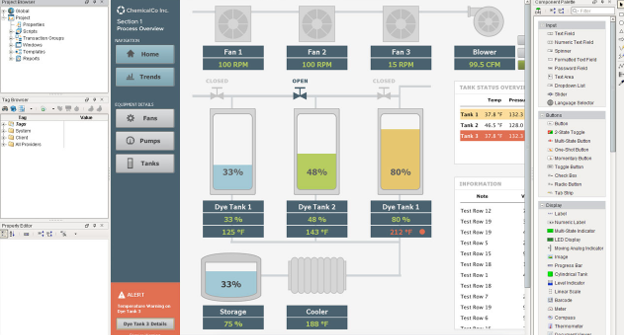
It’s difficult to use an HMI effectively when visual elements are laid out haphazardly on screen.Your HMI screen needs to communicate important information and guide the user with clearly defined actions to take. Below are three design tips to establish order by using alignment and grids to your HMI design.
Tip 1: Use Alignment to Show Relationships
Word-processing and graphic-design software offer a familiar tool called alignment. Alignment is a process where you take elements and line them up using reference points, such as the edges or the center of text boxes and objects. Use alignment to create order and communicate important relationships between elements.
On the left side of the diagram, there are several elements laid out in no particular order. The elements are color-coded, but there is no clear relation between the elements. By aligning the elements, you make the relationship between the elements much more apparent, and the user will see them in two distinct groups.
Tip 2: Use Grids to Add Rhythm and Order
Use grids to apply order to your HMI design. Grids provide a framework upon which you can lay out elements. You can customize grids to be as fine or as coarse as you need, giving you extreme design flexibility. Furthermore, a grid has uniform spacing that creates a visual rhythm. Grids introduce uniformity and familiarity which help set the visual rules for your HMI. The visual rules define specific areas for specific purposes, such as navigation, data viewing, and imagery. The user builds expectations based on the visual rules that you established for your HMI.
Tip 3: Use Columns to Break the HMI Into Sections
Columns are widely used in the designs of websites, magazines, and newspapers. Columns use alignment and grids to divide a space into vertical sections. These sections determine the flow and the spaces dedicated to certain elements of your HMI design.
The 12-column grid is the most commonly used layout. The 12-column grid divides your workspace into 12 sections which can then be broken up into smaller two-, three-, four-, or sixcolumn spans. The spaces between the columns are called gutters and they create breathing room between your elements. In the example shown below, the BBC website uses a 12-column broken up into three-column spans.
Starting from the left, the first column span is for navigation, the middle column span is for primary information, and third column span is for secondary information. Users are able to anticipate the flow of your HMI design based on the visual rules set by the columns.
Using alignment and grids helps you to create a highly organized HMI design with rhythm and visual flow. The visual rules you set for your HMI design can reduce the user’s cognitive load, empower them to make better decisions, and increase their overall effectiveness.
Need help with your next SCADA project? Contact VisiPraxis to learn more about how we can apply professional project management and design principles to reduce your cost and risk for your next visualisation and control project.
Credit: Inductive Automation


